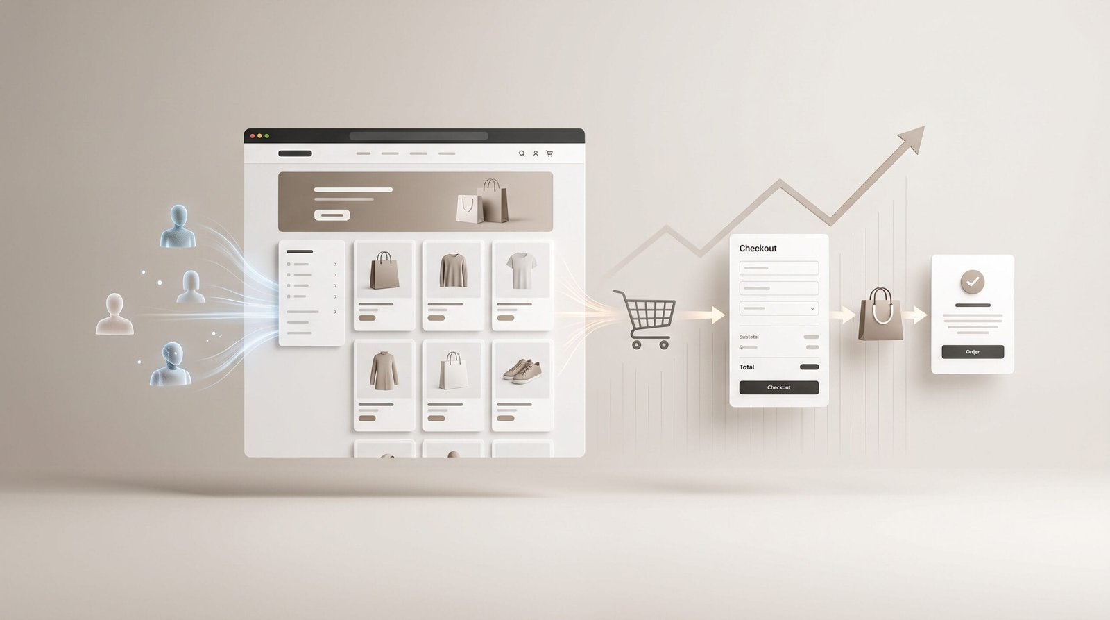
Getting visitors to an online store is positive, but traffic alone does not guarantee sales. You can invest in SEO, paid advertising or social media and attract a significant number of visitors without seeing orders increase at the same rate.
When this happens, the problem is not necessarily a lack of traffic. In many cases, the opportunity lies in getting a higher percentage of existing visitors to complete a purchase.
Improving ecommerce conversion means reviewing the entire customer journey: from the moment someone lands on the website to the moment they find a product, resolve their questions, trust the business and complete the payment.
In this article, we look at the main areas to review if you want to improve your ecommerce conversion rate in a practical and sustainable way.
What Does Improving Ecommerce Conversion Mean?
An ecommerce conversion rate represents the percentage of visitors who complete a specific action, usually a purchase.
For example, if an online store receives 2,000 visits and generates 40 orders, its conversion rate would be 2%.
This figure alone does not tell you whether a store is performing well or poorly. Results depend on the sector, type of product, price, traffic source, device and many other factors.
For that reason, improving conversion is not about chasing a particular percentage. It is about identifying what is preventing visitors with genuine purchase intent from completing the process.
Before Changing Your Store, Find Out Where the Problem Is
One of the most common mistakes is changing elements of an ecommerce website without first analysing how visitors behave.
Before changing colours, buttons or images, try to answer a few basic questions:
- Which pages receive the most traffic?
- Where do visitors come from?
- Which products generate the most interest?
- How many users add products to their cart?
- How many start the checkout process?
- At what point do they leave?
- Are there significant differences between mobile and desktop?
- Are there technical problems affecting the customer journey?
This information helps distinguish between a traffic problem, an offer problem and a conversion problem.
For example, if a store receives a lot of traffic but very few visitors add products to their cart, the issue may be related to the commercial proposition or product pages. If many users add products but abandon during payment, the checkout process should be investigated.
1. Improve the User Experience
An ecommerce website should allow visitors to find what they are looking for without having to learn how the website works.
Navigation should be logical and categories should make sense from the customer's perspective. If finding a product requires too many clicks or the menu is confusing, some visitors will leave before reaching the product page.
Pay particular attention to:
- Menu structure.
- Categories and subcategories.
- Internal search.
- Filters.
- Navigation on mobile devices.
- How easily users can return to search results.
A good user experience does not necessarily mean adding more elements to a page. In many cases, it means removing unnecessary obstacles.
2. Improve Your Product Pages
The product page is one of the most important parts of the purchasing journey. It is where users decide whether the product meets their needs and whether they are willing to pay for it.
A product page with very little information can create doubts that ultimately lead to abandonment.
Depending on the product, the page should provide enough information about:
- Main features.
- Materials, dimensions or specifications.
- Uses and applications.
- Availability.
- Price.
- Options or variations.
- Shipping conditions.
- Delivery times.
- Returns and warranties.
Images also play an important role. Customers cannot physically touch or test the product, so photographs should help them understand exactly what they are buying.
Where appropriate, consider using different angles, close-ups, scale references, videos or examples showing the product in use.
3. Make Your Value Proposition Clear
Visitors should quickly understand why they should buy from your store rather than somewhere else.
This does not necessarily mean being the cheapest option. Your advantage could be your expertise, customer service, product quality, delivery speed, customisation or another factor that matters to your target audience.
An effective value proposition should answer a simple question:
Why should I buy this product here?
If the answer is not obvious, the store may have a commercial problem that no design change can completely solve.
4. Remove Doubts Before the Purchase
Many visitors do not leave because they have decided that they are not interested in the product. They leave because the store has failed to answer an important question.
It could be a question about size, compatibility, delivery, returns, warranty, payment methods or even whether the company can be trusted.
A useful approach is to identify the questions customers ask most frequently and answer them directly on the website.
FAQs can be useful, but they should not become a separate collection of information disconnected from the buying journey. When a question is important to the purchase decision, the relevant information should appear at the point where the customer needs it.
5. Build Trust
Trust is particularly important in ecommerce. Customers are providing personal information and, in many cases, making a payment to a business they have never physically visited.
A professional online store should make it easy to understand who is behind the business and what the purchasing conditions are.
Elements that can help include:
- Clear information about the company.
- Easily accessible contact details.
- Clear purchasing conditions.
- A straightforward returns policy.
- Shipping information.
- Recognised payment methods appropriate for the target audience.
- Genuine customer reviews when available.
- A technically well-built and secure website.
Trust is not created simply by placing icons or badges on a page. It comes from consistency and transparency throughout the entire customer experience.
6. Simplify the Checkout Process
The closer a customer gets to completing an order, the fewer obstacles they should encounter.
A checkout process that is too long, unnecessary forms or unexpected requirements can cause customers to abandon their purchase at the final stage.
Review whether you genuinely need every field you request and whether customers understand what they need to do at each stage.
It is also important to clearly display:
- Cart contents.
- Total price.
- Shipping costs.
- Delivery times.
- Payment options.
- Relevant terms and conditions before the order is completed.
The checkout should not be where customers discover the real conditions of the purchase.
7. Optimise Your Store for Mobile
An online store may work perfectly on a desktop computer and still provide a poor experience on a smartphone.
That is why simply having a responsive design is not enough. You should test the entire purchasing journey on an actual mobile device.
Pay particular attention to button sizes, forms, menus, filters, product images and the payment process.
It is also worth analysing whether certain pages have significantly higher abandonment rates on mobile than on desktop. A substantial difference may indicate a specific usability or performance issue.
8. Improve Speed and Performance
Page speed directly affects the user experience. Slow pages make navigation more difficult and can cause visitors to leave before they find the information they need.
Performance should be reviewed particularly on:
- Category pages.
- Product pages.
- Search and filtering.
- Shopping cart.
- Checkout.
This is not simply about achieving a good score in a performance testing tool. The important thing is that the store responds quickly and works reliably throughout the purchasing journey.
9. Review Shipping Costs and Delivery Conditions
Shipping costs and delivery times can completely change how customers perceive a purchase.
If a product initially appears to have an attractive price and significant additional costs are revealed later, the customer may decide not to proceed.
Whenever possible, communicate shipping information clearly and early in the buying process.
Also explain whether free shipping is available, what conditions apply, how long delivery takes and what happens if the customer needs to return the order.
10. Use Clear Calls to Action
Customers should always understand what the next step is.
On a product page, the purchase button should be easy to identify and supported by the information needed to make a decision.
Avoid filling the interface with too many competing calls to action. If everything is trying to attract attention at the same time, nothing stands out.
The main call to action should support the purpose of the page and appear at a logical point in the customer's journey.
11. Use Social Proof Naturally
Reviews from other customers can help reduce uncertainty, particularly when visitors do not know the brand or are comparing several alternatives.
Reviews are more useful when they provide specific information about the product or buying experience.
For example, a review explaining how a particular size fits can be much more useful than a simple numerical rating.
However, reviews must be genuine. Inventing reviews or presenting ratings misleadingly can damage the trust you are trying to build.
12. Do Not Try to Improve Everything at Once
One of the most effective ways to optimise an online store is to work according to priorities.
If you simultaneously change the design, product pages, prices, checkout and advertising campaigns, it becomes difficult to determine which change actually produced a result.
Instead, identify the main friction points, establish a hypothesis, make a specific change and measure its impact.
This process can be repeated progressively to create a more effective purchasing experience.
Which Metrics Should You Analyse?
Conversion rate is important, but it should not be analysed in isolation.
To understand what is happening in an online store, it can be useful to monitor:
- Conversion rate.
- Average order value.
- Percentage of users who add products to their cart.
- Cart abandonment rate.
- Checkout abandonment rate.
- Performance by device.
- Conversion by acquisition channel.
- Products with high traffic but low sales.
- New customers compared with returning customers.
Looking at these metrics together provides a much more useful picture than simply counting the total number of orders.
Conversion Starts Before Visitors Reach Your Store
It is also important to remember that conversion does not depend exclusively on what happens inside the ecommerce website.
The advertisement, search result, social media post or any other acquisition channel creates expectations before the visitor arrives.
If a campaign promises one thing and the landing page presents something different, conversion will be affected.
For this reason, your message should remain consistent from the first interaction through to the order confirmation.
Improving Conversion Is Not Simply About Changing the Design
Design matters, but an ecommerce store that converts well requires much more than an attractive interface.
User experience, content, value proposition, technology, performance, trust and commercial strategy all need to work together.
In some cases, a small checkout improvement can have a greater impact than a complete redesign. In others, the problem may be an unclear product proposition or traffic that does not match the target audience.
That is why it is important to analyse what is actually happening before investing in major changes.
When Should You Review or Redesign an Online Store?
If an ecommerce store has accumulated usability, performance, navigation or content management problems, there may come a point when making isolated changes is no longer the most efficient option.
A deeper review may also be necessary when the business has grown and the original store no longer meets its current requirements.
In these situations, the objective should not simply be to create a more modern-looking website. The project should start with the needs of the business, user behaviour and commercial objectives.
Conclusion: More Traffic Does Not Always Mean More Sales
Improving ecommerce conversion is largely about removing the reasons that cause interested visitors to decide not to buy.
Complicated navigation, incomplete product information, unexpected shipping costs, lack of trust, a lengthy checkout or a poor mobile experience can all have a direct impact on sales.
The most effective approach is to analyse the entire customer journey, identify friction points and prioritise the improvements most likely to have a real impact.
If you need to review the user experience, technology or structure of your ecommerce store, Orizontic works with businesses on the development and improvement of their digital solutions. You can learn more about our ecommerce development services.
Before investing in more traffic, make sure your store is ready to make the most of the visitors it already receives.